Justine's Course Work

Fall 2022 EDCI 337

Assignment 4: Multimedia Project

Retrieved from ApplyBoard

A Guide to Student Budgeting

Group Members: Michelle Mylrea, Sydney Barr, Sehee Park & Justine Cook

Introduction

This lesson is designed to educate students on conscious spending with a limited budget. It is divided into 3 topics: spending on food, spending on educational tools and resources, and spending on lifestyle, and is taught by using various forms of multimedia. The lesson also includes information about how 4 current university students are spending their money. To help support and encourage active learning, the students are asked to create their own budget at the end of the lesson.

Learning Objectives

In this lesson the audience will:

  • Gain insight into spending habits as a university student
  • Identify and reflect on the main purchase habits that are the most expensive. 
  • Show student budgeting concepts and applications and practice how to reduce spending. 
  • Create an optimal budget based on their personal values, needs, and wants.

Food

Food is an essential part of student budgeting. Students need to consider how fast their money can go when they are eating out or ordering food for their homes. Balance is always crucial when spending on food, but there are tricks to help students with tight budgets spend a little less. The screencast details four tips on how to save money on food better along with creating good decision-making habits when grocery shopping.

Screencast created by Sydney

Education

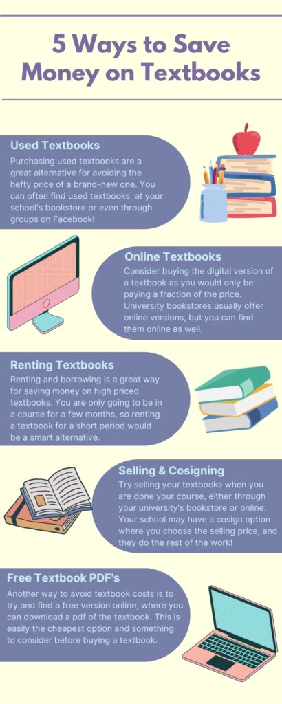
Students face many expenses regarding their education; including tuition, student fees, textbooks, and supplies. While there are some educational expenses that are unavoidable, students are able to make alternative decisions on certain purchases as a way to save some money. Textbooks are often a required resource for university courses, however, they can come to be very expensive. According to Mark Brown’s article, What Canadian University Students can Expect to Pay for Books (2017), the average amount spent by students at the University of Victoria comes to $780.94 per school year. The infographic below outlines five alternative ways of acquiring textbooks to encourage students to be smart with their money.
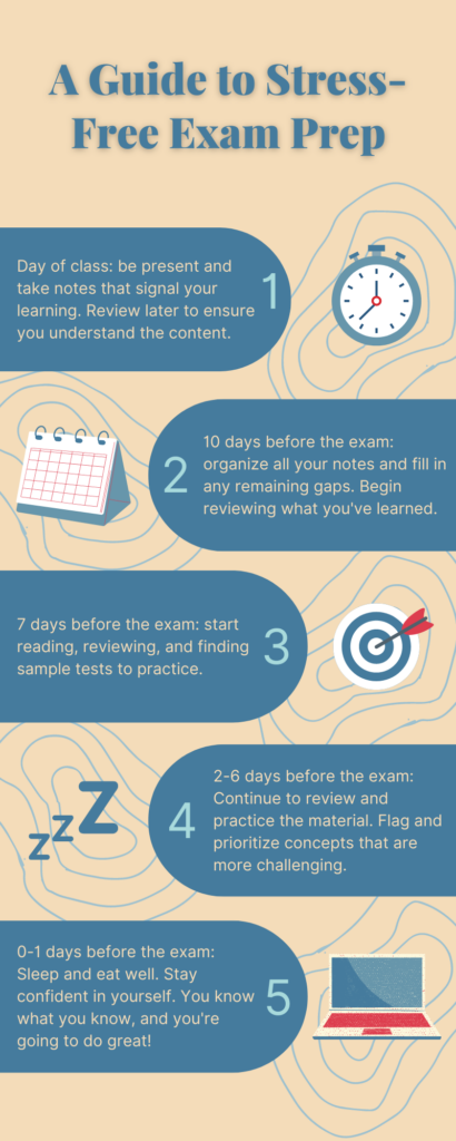
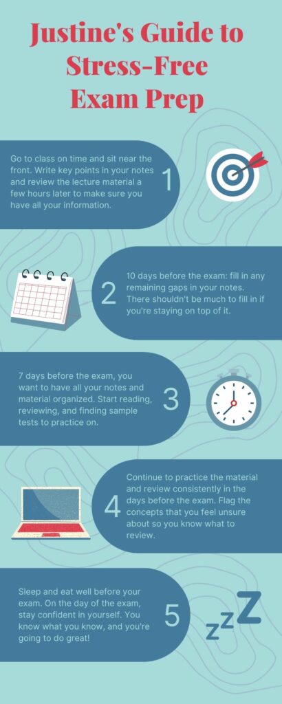
Infographic by Michelle

Lifestyle

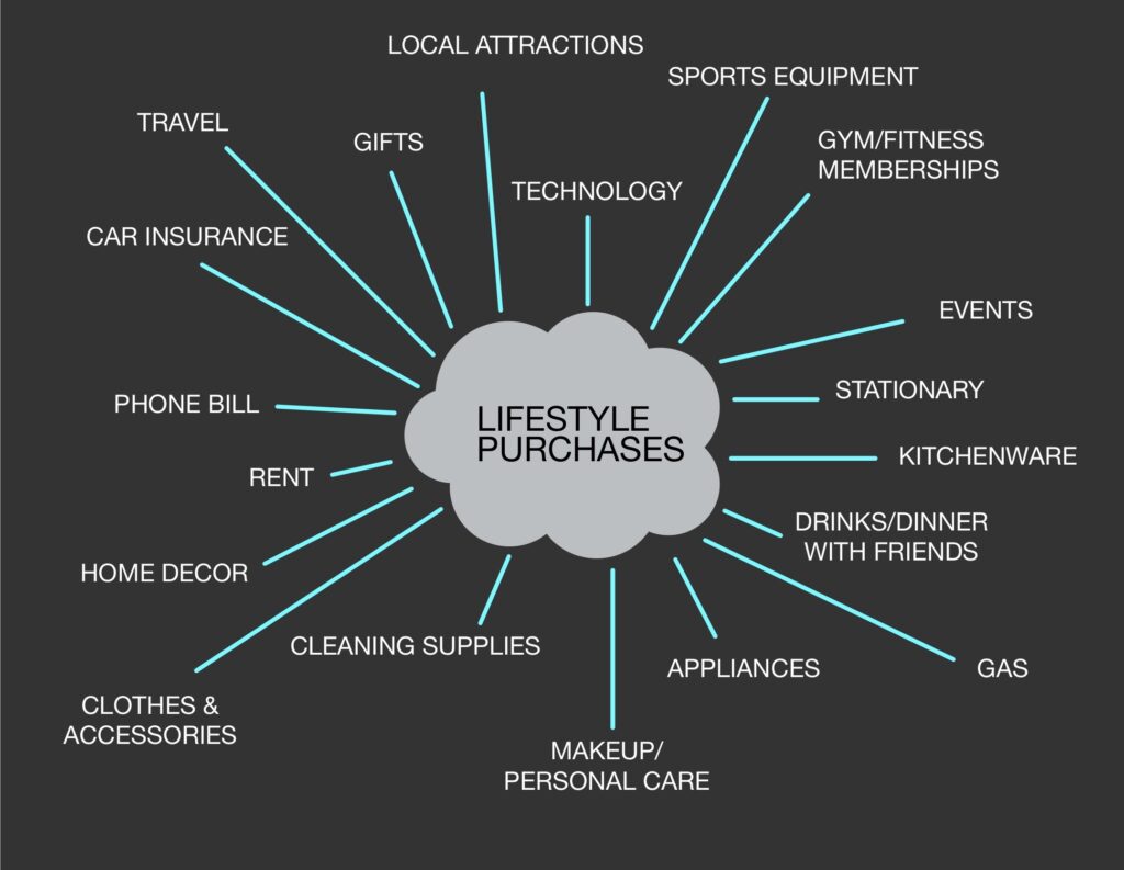
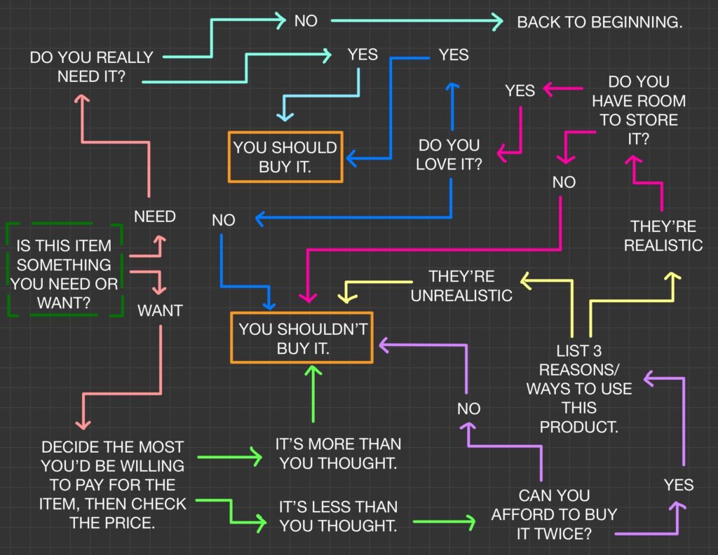
Students can choose to spend their money on a variety of products and services, and this all depends on their individual values. Below is a mind map outlining examples of lifestyle purchases a person can make, and there is a sketchnote outlining a recommended process to decide whether or not an item is worth the purchase. A strong indicator of whether or not to make these purchases is to decide if the product or service is considered a “need” or a “want”. Begin the sketchnote at the first question on the far left.

Mind map created by Justine
Sketchnote created by Justine

Student Opinions

In our podcast, we discussed the challenges, highlights and importance of student budgeting. The varying opinions we heard depict the similarities and differences in how we spend our money as students. It is important to recognize that every student has a different approach to spending and saving and some people may be better in one area, but require improvements in another. Click the picture below to listen.

Retrieved from Canva
Podcast created by Sehee

See transcript here:

To Do This Week

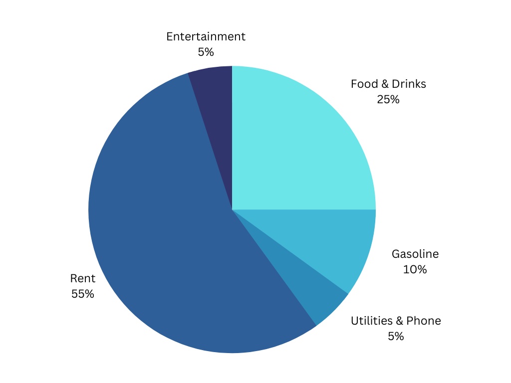
This assignment is for the purpose of getting familiar with budgeting and tracking your spending. You will be creating a pie chart based on your personal monthly spending along with answering six short questions to which you will be reflecting on your personal budgeting strengths and weaknesses.

See below for an example:

Pie chart created by Michelle

Reflection

Graphic Design

Graphic design is important for comprehension because it helps students to stay engaged with the topics at hand. Creating a piece of multimedia that is visually appealing is important for retention. We incorporated graphic design tools into our infographic, sketchnote, and screencast video. Both learning objects include tools such as colour, proximity, balance and contrast to improve the learning experience by keeping the design visually appealing and easy to follow.

Storytelling

Storytelling in multimedia is essential when trying to create relatable and engaging content. As it allows students to use their imagination and experience. It also helps to make the content more personal as individual experiences show a lot of depth. In the sketchnote, a story is created for the reader as they decide whether to buy the item or not. A narrative is created for the object that the person wishes to buy. Personal stories are also shared in both the podcast and the screencast – as this helps the narrative feel comfortable, engaging, and relatable.

Dual Coding Theory

Allan Paivio’s Dual Coding Theory highlights the difficulty of only having one form of delivering information. One being language and the other being image. Having both verbal and visual stimuli makes it easier to remember and process information. This theory supports a way of learning that many individuals prefer, which is used in a screen-casting format. 

Cognitive Load

We have tried to reduce cognitive load by limiting the word count in each of the section introductions. Cognitive load theory has concluded that “Working memory capacity can be effectively increased, and learning improved, by using a dual-mode presentation” (Sweller, Ayres & Kalyuga, 2011). By creating media that includes dual coding theory, cognitive load is reduced.

Multimedia Design for Learning

It is essential to incorporate multimedia design into WordPress blogs because too much wording with too few breaks can be very overwhelming. Combining various types of media helps to make the content easier to digest and overall more engaging and interactive. This lesson plan accommodates both verbal and visual preferences for learning and includes opportunities for practicing budgeting too.

Accessibility

Recognizing different forms of diversity and learning needs is important for creating a better learning environment for everyone. The goal for future education should be to remove barriers that prevent people from accessing education. We followed the practical design choices such as using simple text, adding captions, creating audio files, and using visuals to explain concepts. 

References

Brown, M. (2017, December 4). What Canadian university students can expect to pay for books. Macleans.ca. Retrieved December 1, 2022, from

Sweller, J., Ayres, P., Kalyuga, S. (2011). The Goal-Free Effect. In: Cognitive Load Theory. Explorations in the Learning Sciences, Instructional Systems and Performance Technologies, vol 1. Springer, New York, NY. https://doi-org.ezproxy.library.uvic.ca/10.1007/978-1-4419-8126-4_7

Blog Post: Week 12

Have you used a tool like Khan Academy that creates a learning path for you? Did you find it to be useful or a hindrance to your learning? Or both?

Retrieved from Khan Academy

Yes, I have used Khan Academy before. I have never been that confident in my mathematic abilities, and I found it helpful to have a free resource available that could offer a different perspective on the topics I was struggling with. To this day in my math-based classes, I do tend to see if there is a video on Khan Academy that can help me to supplement my learning.

Unfortunately, I have struggled with Khan Academy in the past as well. I found that there were some topics or examples that did not align with the issue I was having. Despite all the time I spent trying to find the information I needed, I would feel more and more frustrated when I was unsuccessful. I think that Khan Academy and other AI/online learning platforms are very useful when used as the primary educational resource, however, it can be difficult to use them as secondary resources. In some cases, my teacher would give an example on the board, but the teacher on Khan Academy would use a different example, therefore I wouldn’t get the information I was looking for and would feel more defeated.

Overall, I think there are both pros and cons to the use of AI platforms. If you want to learn a new language for a trip and you download Duolingo, that is a great opportunity to engage with a personalized learning plan. On the other hand, if you want to learn how to do a very specific math problem, it’s probably better to skip Khan Academy and go visit your teacher.

Blog Post: Week 11

Retrieved from UC Today

*EDIT*

After doing some more research and getting some help from the professor, I managed to get my twine story into my GitHub page. Play it here!

How was your experience with Twine? Would you use it again? In what type of learning do you think Twine would be particularly effective?

I created a Twine story and I am very proud of it – I decided to apply the dilemmas I am going through in my life to this gamified storyline. I have explored two opposite answers and storylines in each of the two attached videos. I had a lot of fun using Twine for this project.

I appreciate that the introduction of twine helped us to personalize our learning. having an interactive story creates a “self-directed” element, where you can go at your own pace and experience your choices individually. I have always loved the storybook games where you make the choices and see how the storyline changes. I think that this platform is great in an educational sense because it takes a lot of pressure off of learning. It could help the student feel more in control of their abilities, and teach them to be confident in their decisions. I think using twine stories would be useful in any school subject, but I think it would be particularly useful in lifestyle courses such as career planning or lesson about time management or money management. It could help shed some light on how their life might change in the long run based on short-run decisions.

My storyline is relatively basic; I am not very confident in my coding abilities, so I did as much as I felt was needed without stretching myself too far. The most options I had at one time was three, and the most responses I needed to create at one time was four. The most fun part about this plot line was it gave me a lot of perspective into what my options are/decisions could be, and it made me feel so much better, knowing that there are always opportunities to change things. I would absolutely use this application again, I just didn’t love the fact that I needed to create yet another account on yet another platform to share it. I think that Twine would be very effective for an author who is brainstorming potential plotlines for a book. It would be useful to understand how far a particular storyline could go. Using Twine as a roadmap would be great because you can weigh a certain plotline against another and choose how the ending could be from each decision.

Assignment 3: Core Multimedia Skills

Multimedia objects are crucial for material understanding. By incorporating theories and principles into various interactive elements, students are able to understand the material at all capacities and levels. It is important to include multimedia design and objects in lessons so that no student feels left behind. As an educator, I feel it is my responsibility to pave a path for diverse and inclusive learning, and using multimedia is a fantastic way to ensure the content is delivered to and understood by each of my students.

I have chosen to upgrade the infographic from my week 5 blog post, linked here.

I chose this object for my project because I got some key feedback from Professor Watt about paying attention to principles and making better connections to them, and I would like to develop it further. This project is a great opportunity to improve this infographic to be something I can be proud of and would use in a classroom setting. On the upgraded infographic, I focussed on developing the following:

  • Creating a more interactive activity that is better suited to the classroom environment.
  • Visualizing how the infographic would sound if someone were to present it in class.
  • Reducing cognitive load.
  • Improving the design and feel.
  • Creating a story and staying direct.

In this new infographic, I feel that the elements of interactive design are much clearer. I decided to focus more on contrasting colours, and a consistent background to decrease distraction. I changed the wording to create more of a “timeline” and “storytelling” feel and I also increased the font to limit extraneous cognitive load while making it more legible. I reduced the amount of text to complement Mayer’s Principles such as coherence and spatial contiguity. To make the object more accessible, I recorded and attached a voiceover of the infographic content. The voiceover makes the infographic more inclusive of students who may struggle with visual objects. I kept the layout the same, as I think that having an alternating feel is more engaging, and most of the copy is the same as the previous version.

Blog Post: Week 7

Reflection Question: What storytelling techniques have you used instinctively and which ones require more work for you? Which techniques will you focus on moving forward?

When it comes to personal storytelling, I’d say my strengths lie with creating suspense in the plot, and telling the stories chronologically. I find that I get very immersed in storytelling, I think it is a great way to portray personal experience, feelings, and decisions – and this creates an opportunity for new levels of connection. When catching up with friends or peers, I find it very easy to tell things in chronological order because everyone experiences time in the same way and it is difficult to lose track of. Additionally, it is a great way to provide context. On the other hand, I often feel like I am too detailed when it comes to storytelling because I find that I take way too long to get my point across, or to get to the pivotal moment of the story. I care a lot about creating the setting for the story and I think I tend to get too carried away with the background information. I suppose this can be both a strength and a weakness because while I care about how the people understand the situation, maybe I mention a lot of redundant things in the process. In the future, I think I should also try telling the key learning at the beginning and working backwards to create a different form of context.

Retrieved from Cambridge University Press

Storyboard Exercise

The Storyboard project was challenging for me. I wasn’t sure if I was on the right track, and I struggled to find a fitting topic. I am looking forward to your feedback, reader! In the end, I chose to write my story about a girl named Jane learning to use her camera beyond the “auto” shooting mode. Using a waterfall as a subject made sense to me because it is moving, and moving objects can create great effects in pictures when captured in different ways. Enjoy!

Blog Post: Week 6

Reflection Question: Where do you see constructive alignment and backward design used in this course or another course you are taking/have taken? Is there anywhere where it seems to be missing?

Retrieved from Junior Scholastic

The biggest element of backward design I have seen in this class, and some others, is the use of Learning Objectives or Key Outcomes. Though many students do not prioritize reviewing these objectives before an assessment, they truly do pave the way forward through the chapter and especially for test preparation. Learning Objectives are a key element in lessons or chapters because they outline the things that the student needs to understand – and this is useful because it allows for appropriate compartmentalization. The student can focus on the key points at hand, and they can block out any other noise or non-applicable information. It is also safe to say that most of the questions on a proper exam or test will be based on these Learning Objectives.

I have encountered some classes/professors that do not set the Learning Objectives for the chapter or topic before diving into the content, but even worse, I have definitely seen some professors wait to build their exams until the last possible second. Recently I had one exam that had a very low average. The professor blamed this issue on covid, but I would argue it was because the professor did not adjust the test for the group of students that took the test, and expected all students to be on the same level of understanding as previous groups of students were in previous years.

For my peers – here is a video I have found that helps with creating effective Learning Objectives in the education space:

Lastly, here is my lesson plan for a Supply and Demand lecture in a beginner’s economic theory course. This template is a great way to make sure everything relevant is covered in the lesson.

Blog Post: Week 5

Reflection Question: Which design principles did you use to create your infographic in Canva? Which elements of a ‘good infographic’ were you able to incorporate? What other principles did you consider?

This week, I made my infographic on the topic of studying for exams. I did this for a couple of reasons. Firstly; I made this infographic because it is midterms season and it is perfectly normal to feel behind and unprepared when the first midterm hits – it always happens sooner than everyone thinks. Secondly, I made this infographic on this topic because I feel like it took me a long time to figure out how I study best and although every student learns and studies differently, this can be another option for anyone still finding their footing on how to study best. I have the mentality of “if it works for me, it probably works for someone else too”.

I found that it was most important to limit the number of words included in my infographic. As mentioned in the resources about good and bad PowerPoints, too many words on the screen can cause a lot of busyness and can negatively impact learning. By sticking with the most important points within each section and attributing the right icons, I figured that prioritizing a simple design would be the most effective. I also prioritized the use of negative space in my infographic. It is important to leave room for the information itself to take centre stage – because that is evidently what the reader grabs an infographic for!

Blog Post: Week 3

Reflection Question: What did you notice about your learning when you listened to the Soundcloud by Howat? How was it different from reading an article?

Listening to the Soundcloud episode felt unproductive for me. I have learned that I am a visual learner, and not having a visual cue to follow was difficult for me to stay focused. I listen to podcasts often, but I usually listen while I am doing something else such as walking, as this helps my brain compartmentalize better. In this scenario, I wanted to take notes on the information provided in the episode, but I really struggled to do so because of the way the information was presented. I found it hard to keep up with what the speaker was saying. Additionally, the episode covered a lot of content that we have already discussed in the course, so in that sense, I felt that there was an element of redundancy in the learning.

Sketchnoting

I created my sketch note on the main steps of service that a server follows in the restaurant industry. As I have just started a new serving job that has high expectations, I have had to create a “checklist” scenario in my head so that I remember how and when to interact with the guests at my tables. Additionally, habits and mannerisms are key when serving guests in a sophisticated setting, so the blue tabs indicate what I need to remember in each step (whether it is something I need to do or some way I need to behave). If there are any other servers in the class, they will understand how many more steps there are in between these ones, but these cover the main checkpoints.

Blog Post: Week 2

Reflection Question: Of all the principles of Cognitive Theory of Multimedia Learning we looked at this week, which seem intuitive to you?

This week’s content covered 4 principles: the Redundancy Principle, the Coherence Principle, the Signalling Principle, and the Contiguity Principle. While all of these principles seemed understandable and self-explanatory in their own way, I felt that the first two principles, Redundancy and Coherence Principles, seemed the most intuitive.

The Redundancy Principle is designed to help an educator understand that reading text, seeing graphics, and hearing narration can be detrimental to information retention. I find this to be true because it is quite difficult to focus on doing multiple things at once, particularly if they involve using multiple senses.

Retrieved from iStock

The Coherence Principle is designed to help an educator understand that unrelated information should be excluded in order to avoid overwhelming the learner’s brain. By keeping everything in a presentation on-topic and in context, information retention will improve greatly.

Retrieved from freepik

While I was learning about these principles, I found that they collectively had a theme of “eliminating unnecessary information in order to focus on presenting key information”. This point stood out to me because I find it can be so easy to get lost in creating elaborate presentations, which results in the audience spending the entire time wondering what to focus on instead of listening to the presenter. I’ll keep these principles in mind when I make my next presentation!

Blog Post: Week 1

image retrieved from iStock

I have decided to take this course because I wanted to learn more about the faculty. Being an Economics Major, my studies have been focused on learning new material, instead of learning how to learn new material. The advice I give to anyone starting university is always “use first year to learn how to study;” the reason behind that is that I never really did that myself. I realize I have almost finished my entire degree, but don’t worry reader, I definitely did figure out how to study. The year of online learning during COVID helped me and my educational experience immensely, and while it sucked not being able to go to campus and see friends and meet new people, it did wonders for my grades (in hindsight, it might have been a great idea to take this course during that year, but I guess we live and learn right?). So, at this point, I feel like I have learned enough about myself and my study habits that I have the capacity to learn a bit more about the range of platforms out there that I can use in post-grad studies or in my career. This is an excellent time for me to take this course because I am just on the verge of deciding what next steps to take in my life after graduation, and being more “technologically literate” is always a good thing in this day and age. I am looking forward to learning about some of the tools that are out there to help people learn, create, and collaborate better in an ever-changing world.